Analysis of Design: Zen Garden
Example: 218


Design Elements and Structure
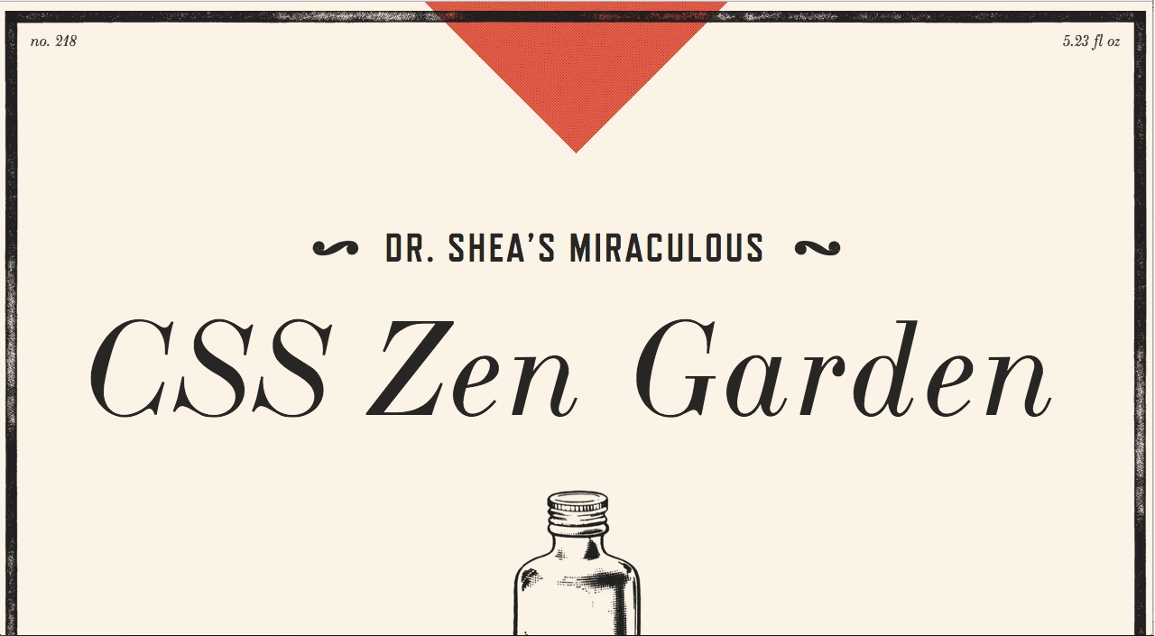
This layout displays retro looking elements in a clean and organized structure.
The design is not confusing but presents
several information at the same time.
Colors
The designer uses a small amount of colors to the pallete, but the choice of
fun colors like orange makes the design attractive and true to its concept.
Type
In this case, the designer drifts away from the rule of minimal typography and chooses
several font families to the page's titles. The fact that the rest of the text never changes the font
and that the font families to the titles are similar in context, is the reason this design works.